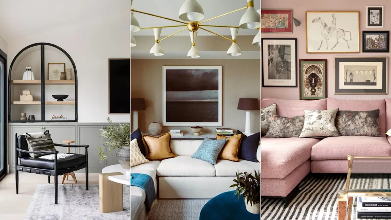
Choosing living room colors is more than a design project, it’s a reflection of how we live now. Color has become the emotional centerpiece of that space, especially after years spent indoors. Today, designers are pushing back on overused tones and looking for warmth, complexity, and staying power.
If you’re planning to refresh your space, here are the living room colors interior designers say are officially on their way out.
Cool gray has finally hit the saturation point. Its once-clean appeal now reads cold and dated.
“The overly cool, blue-based grays are losing relevance,” says Ginger Curtis, founder and CEO of Urbanology Designs. “They often make a space feel sterile rather than inviting.”
Swap it for a warm taupe or mushroom beige. These neutrals feel natural, layered, and better suited for modern living room colors.
Primary red briefly resurfaced last year through the viral “unexpected red” trend. But its aggressive energy is no longer favored in relaxed spaces.
“A bold primary red can feel overwhelming and difficult to style in a modern living room,” says designer Nina Lichtenstein.
Instead, try burnt sienna, a rich, earthy tone with brown undertones that brings warmth without dominating the room. It’s a more grounded, liveable option for contemporary living room colors.
Navy has had a good run. Paired with white, it’s been a go-to for classic schemes. But repetition has dulled its edge.
“While classic, navy can feel heavy and overused, especially in small living rooms where it can make the space feel closed in,” Curtis notes.
To retain that moody depth without the visual weight, opt for inky blue-blacks or smoky teals. They offer a refreshed take on traditional living room colors.
Sage green’s popularity owes a lot to its calming, nature-inspired tone. But its familiarity is now its weakness.
“While sage green has been everywhere in recent years, its muted softness is starting to feel predictable,” says Lichtenstein.
Designers are replacing it with deeper tones like olive green. It adds richness and a grounding feel, qualities today’s best living room colors are expected to deliver.
Pink once felt like the antidote to sterile neutrals. But dusty rose, in particular, has lost momentum.
“The popularity of dusty rose was fueled by its soft, romantic aesthetic, but in a living room, it can often feel too delicate or outdated,” Lichtenstein says.
Curtis agrees: “They lack the depth or freshness needed for modern living spaces.”
Instead, go for a terracotta blush, a pink grounded in earth tones. It’s one of the more sophisticated living room colors trending now.
White walls aren’t going anywhere, but stark, bright whites are falling out of favor.
“Stark, crisp whites can feel too clinical and uninviting, lacking the depth that today’s living rooms need for warmth and character,” Curtis explains.
Designers now prefer off-whites with undertones of cream, beige, or even bone. These warmer living room colors create a more inviting canvas.
For a while, hunter green was a favorite in upscale interiors, especially when paired with natural wood. But it’s now considered too heavy.
“In some spaces, like the living room, it can feel heavy rather than fresh,” Curtis says.
Lichtenstein adds: “They can be energizing but often feel too intense for a space meant for relaxation.” Softer greens like forest or juniper offer a subtler take on biophilic design and feel more timeless.
Mustard yellow made its mark as a vibrant accent. Today, it feels too rigid.
“Vibrant mustard yellow can quickly overwhelm a space, making it hard to pair with other tones,” Lichtenstein explains.
Designers are trading it for soft honey gold or ochre. These options deliver the same energy, but in a way that’s more adaptable to a wider living room colors options.
Dark purples have always straddled the line between luxe and overdone. In the living room, they often land on the wrong side.
“Deep purples have struggled to find a lasting place in interiors,” says Curtis. “Often feeling too moody or hard to pair with neutrals.”
Alternatives like mulberry brown or oxblood still offer drama but are more grounded. These are emerging as more refined choices for accent walls, upholstery, or millwork—especially in bold but controlled living room colors.
Color fatigue is real. We spent years chasing Instagram-perfect walls. Now, it’s time for colors that help us feel relaxed, and rooted.
If your living room still has any of these nine shades, take it as a nudge to reevaluate. Even small changes can energize a space. The key is choosing tones with intention, and knowing when to let go of the old ones.
Share this article: